You may have seen a meme (the idea kind of meme, not the image macro kind) going around comparing states of the northeastern U.S. to urban areas of Texas, like this one showing that Connecticut is about the same size as Houston:
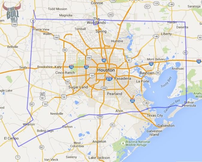
Via The Bull / Facebook
(h/t G)
I found a site (MAPfrappe) that lets you do this by tracing outlines on the map, then dragging them around for comparison’s sake. It even adjusts your outline to account for the Mercator projection. I used it to make an outline of Oahu to show that it’s about the same size as Austin, but then wondered why I spent time doing that when I could have traced Texas in order to compare it to other places around the world.
You can use my outline to compare Texas around the world, too, but here are a few comparisons:
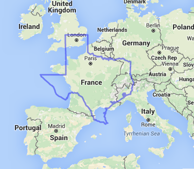
Texas is bigger than France:
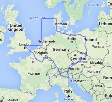
And Germany:
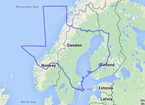
And maybe even Sweden:
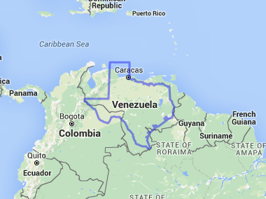
It’s about as big as Venezuela:
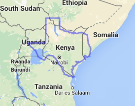
It appears to be bigger than Kenya (this one is dedicated to all the people who talk about Africa like it’s one giant country):
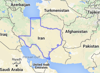
It’s, uh…….hmmmmm:
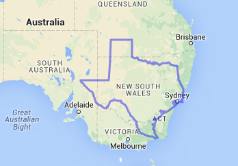
It’s……holy crap, Australia is huge.
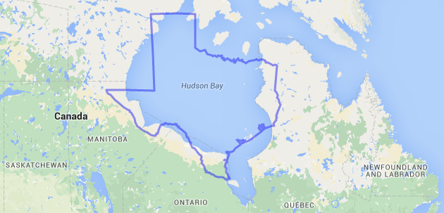
Texas could probably hide pretty effectively in Canada:
And then there’s Russia:
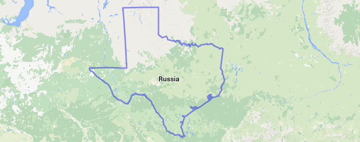
This is in the vicinity of the Sakha Republic, which at 1,190,555 square miles is not only the largest subnational governing body in the Russian Federation, but the largest subnational governing body in the entire world. Texas, at a mere 268,820 square miles, comes in 26th in the world. You could fit four Texases inside the Sakha Republic and have room left over, but with a population of about 958,528 (as of the 2010 Russian census), the Sakha Republic has less than half the estimated population (as of 2013) of the Austin-Round Rock metropolitan area. It’s also much colder than Austin, and we have a Willie statue.
In terms of land area, Texas also places behind Western Australia (2nd), Greenland (4th), Québec (10th), Tibet (14th), three other autonomous regions or provinces of China, and four other provinces or territories of Canada—but Texas is bigger than Alberta, Saskatchewan, and Manitoba (but not if they’re combined).
You win this round, Russia (and China, and Canada, and Australia, and Brazil, and…)


Lmao ur an idiot who ever made this u clearly used google maps which is proportionaly correct
Incorrect
No the website they used auto adjusted the proportions.
If you would read the actual article, you would see he used a software called Mapfrappe. Their software accounts for the curve of the earth to actually stretch the outlines to keep
It proportional. You should try it out.
HOLY CRAP AUSTRALIA IS HUGE
Tonteria
Lmao you are so right
I live in Texas were bigger than France and Germany and we’re clearly bigger than Russia like can you see. Texas clearly surrounds the word Russia
I’m so dang confused and my question was never answered! Please! Is Texas bigger than Alaska?