Oceanfront Property

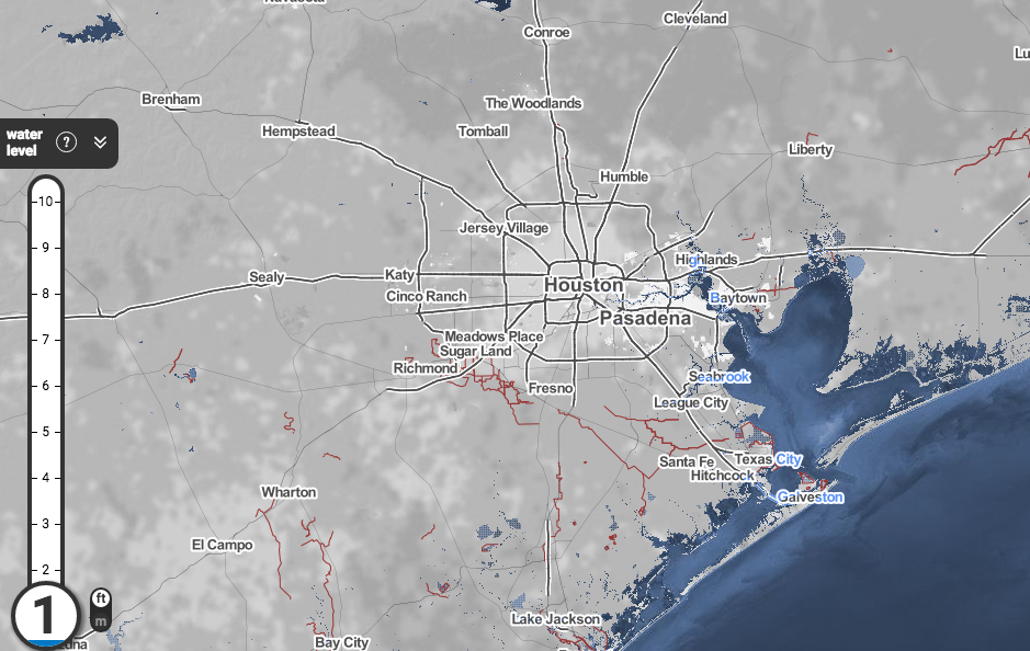
If you’re into this whole “climate change threatens coastal ecosystems” thing (and you should be, because, you know, science and all that), Climate Central has an interactive map that shows how sea-level rise could affect coastal areas.

Here’s Houston, Texas with a one-foot rise in sea levels:

Screen Shot 2016-04-08 at 1.08.09 PM

And here it is with a ten-foot rise: Continue reading

Share

Texas Is Bigger than…

You may have seen a meme (the idea kind of meme, not the image macro kind) going around comparing states of the northeastern U.S. to urban areas of Texas, like this one showing that Connecticut is about the same size as Houston:
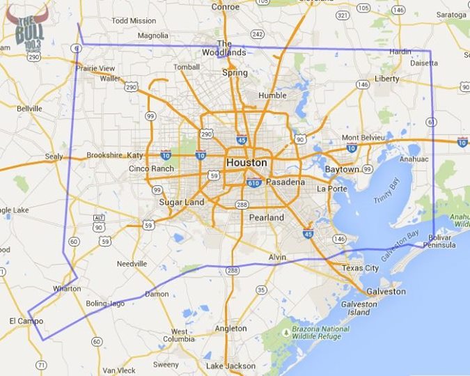
Via The Bull / Facebook

Via The Bull / Facebook

(h/t G)

I found a site (MAPfrappe) that lets you do this by tracing outlines on the map, then dragging them around for comparison’s sake. It even adjusts your outline to account for the Mercator projection. I used it to make an outline of Oahu to show that it’s about the same size as Austin, but then wondered why I spent time doing that when I could have traced Texas in order to compare it to other places around the world.

You can use my outline to compare Texas around the world, too, but here are a few comparisons: Continue reading

Share

Austin and Its Bicycles

Here’s an interesting project that creates maps showing various aspects of city life:

The Social Computing Group at MIT is compiling data for maps that demonstrate the impact that small independent coffee shops can have on life in the big city.

The interactive maps are part of the “You Are Here” project, which creates data visualizations to serve as tools for urban planning at the micro level.

The io9 article shows a map of areas with walkable coffee shops, and I had hoped to see something similar for Austin. We’re not exactly a walkable city, though, are we?

So far, the only map available for Austin shows (you guessed it) bicycle crashes:

Screen Shot 2014-04-23 at 8.54.17 AM

Uh, yay us?

Share